Designing for users you’ll never see

There’s a particular kind of silence every PM knows.
You put your product in front of someone, ask them to do something, and wait.
They click around. They pause. You know exactly where they should go, but you can’t say anything because the whole point is to find out whether they can figure it out themselves (painful every single time).
Lately, I’ve been having a version of that experience with agents. They have access to the right tools and the information they need, yet somehow they still get lost.
Except now the person asking for help might be inside somebody else’s app (ChatGPT, Claude, and others), and your beautifully designed onboarding never gets a chance to explain anything.
That’s what makes designing MCPs such an interesting product problem. We’re getting better at connecting agents to software, but a connection doesn’t tell us much about whether the experience is actually good.
You may have heard the term agentic UX, which explores how we interact with agents that act on our behalf. Building MCPs has made me think about agents as first-class citizens of a product: giving them usable paths through it, while keeping the person behind the task informed and in control.
I’ve started thinking about this through five product decisions: the path, the interface, the feedback, the distribution, and the incentives.
We’ll follow them from an agent getting lost in too much data to a business deciding whether it’s willing to help someone finish somewhere else. Each one changes what a PM needs to design, and what we should count as success.
In this article
- The path: give the agent a way through
- The interface: bring UI into the conversation
- The feedback: look beyond successful calls
- Distribution: test the experience in each host
- The incentives: let the user finish elsewhere
- Rethink what counts as engagement
1. The path: give the agent a way through
Back in May 2025 (about 10 years ago in AI time), I was building investigation agents using an early version of Datadog’s MCP. With all the data available in an observability platform like Datadog, I thought I was giving my agents exactly what they needed.
In practice, the agent could spend hours digging around.
Sometimes a single request brought back enough information to fill the available context before the investigation had really started. I’d have to start again, without the context I’d already built up (while burning through my five-hour allowance at a ridiculous pace, back when Opus was painfully expensive).
Other times, the agent kept collecting data but lost track of what it was supposed to investigate. The agents I was using struggled to carry the work through a long sequence of steps. Plenty of information, and somehow the agent was still getting lost and running in circles.
Heads up: this was an early version of the MCP. Models and MCP design have come a long way since then. We’re still dealing with similar problems at a much larger scale, though. The ceilings have moved; they haven’t disappeared.
Even now, keeping the right context across a long task remains a design problem. A larger window gives an agent more room; it doesn’t automatically give it a clearer path.
What the agent actually needs
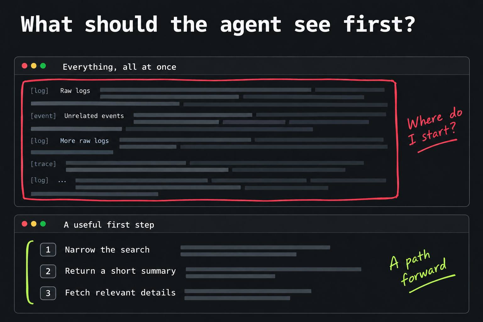
But the lesson stayed with me: giving an agent access to everything can leave it with very little sense of where to begin. A human gets overwhelmed by a cluttered screen; an agent can get overwhelmed by the choices and information we put in front of it.
So I started thinking more about the path. If the task is to investigate a problem, what should the agent learn first? What information would help it narrow the search, and what should it fetch only after that?
Even the amount of detail returned by a tool becomes a product decision, because that detail takes up room the agent might need for the next step.
Imagine asking someone to find a book in a library and handing them every page in the building. Technically, you gave them the answer. You also made finding it unnecessarily difficult. A useful catalogue and a way to open the right book would have helped much more.
This is why the recent wave of “we have an MCP” announcements feels incomplete to me.
I want to know whether an agent can use it to finish a real task without wandering through half the product first. The tool names, descriptions, defaults, and results all shape that journey, even if there isn’t a screen in sight.
2. The interface: bring UI into the conversation
But there might still be a screen, which is the part I underestimated.
A year ago, my mental picture of MCPs was mostly text in, text out. Someone asks a question, an agent calls a tool, and a paragraph comes back.
Now I’m more interested in what happens before that final answer. What should the person be able to see or change while the agent is still working?
Let the person steer before the agent goes too far
Take the investigation from earlier. Imagine asking, “Why did checkout failures increase this morning?” Before digging through everything, the agent could show an investigation panel with a timeline and a proposed plan: compare recent deployments, payment-provider errors, and affected regions.
That gives me something specific to react to. I could adjust the time range, uncheck a lead we’ve already ruled out, or select a region on the chart. Those choices become the agent’s next instructions, while the evidence stays visible (and hopefully we avoid a few scenic detours through the logs).
Later, it could surface a spike alongside the evidence behind it and ask whether to investigate that branch. I can correct the direction while the work is happening.
The interface becomes a place to steer the investigation before a wrong assumption turns into an hour of work.
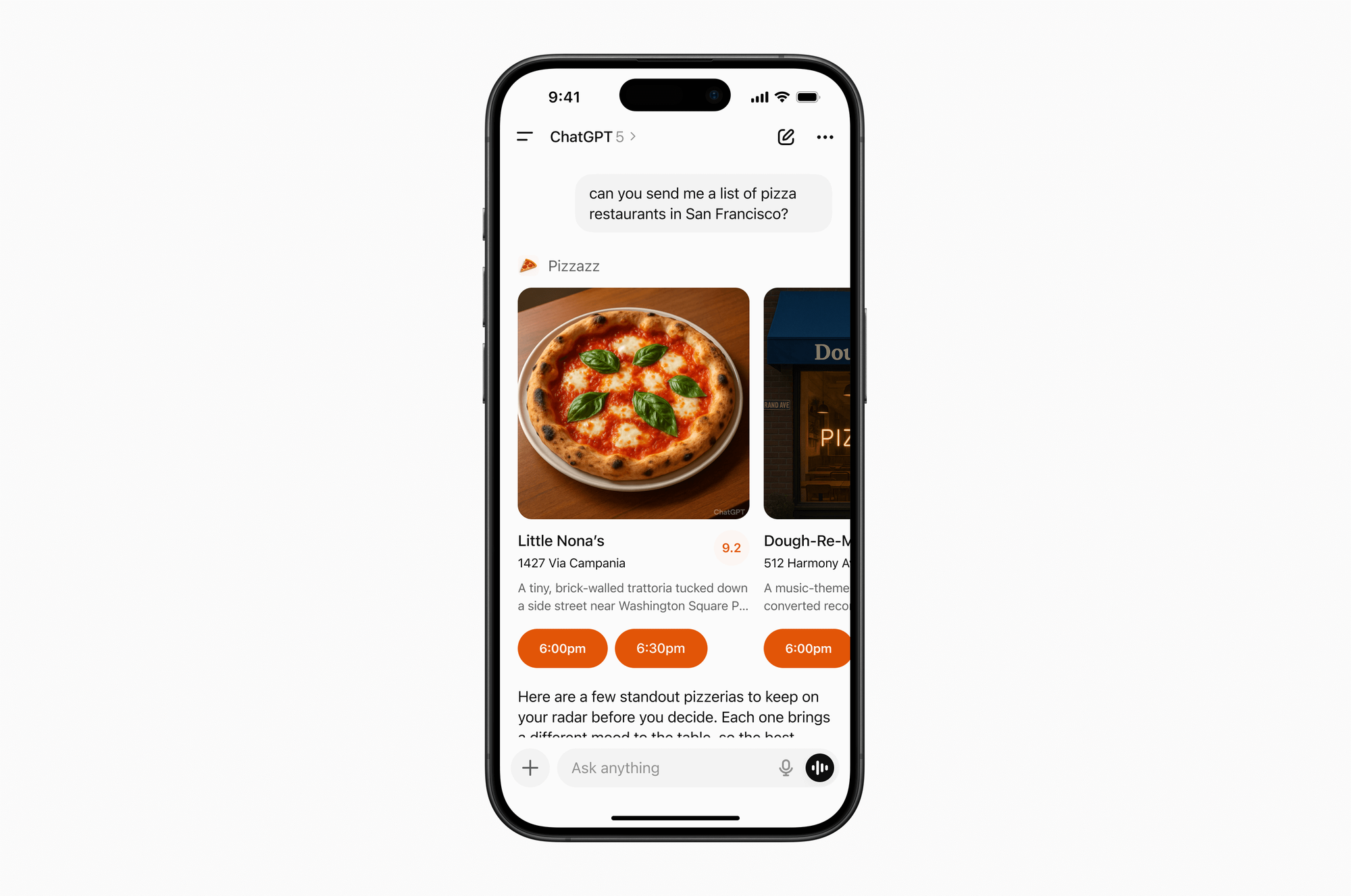
The pieces for this are already emerging. OpenAI supports custom UI alongside the conversation, and MCP Apps provides a shared standard for interactive interfaces inside supporting clients.
OpenAI’s restaurant example makes this concrete. You can browse recommendations, inspect the details, and choose a time inside the conversation (without turning every tap into another prompt).
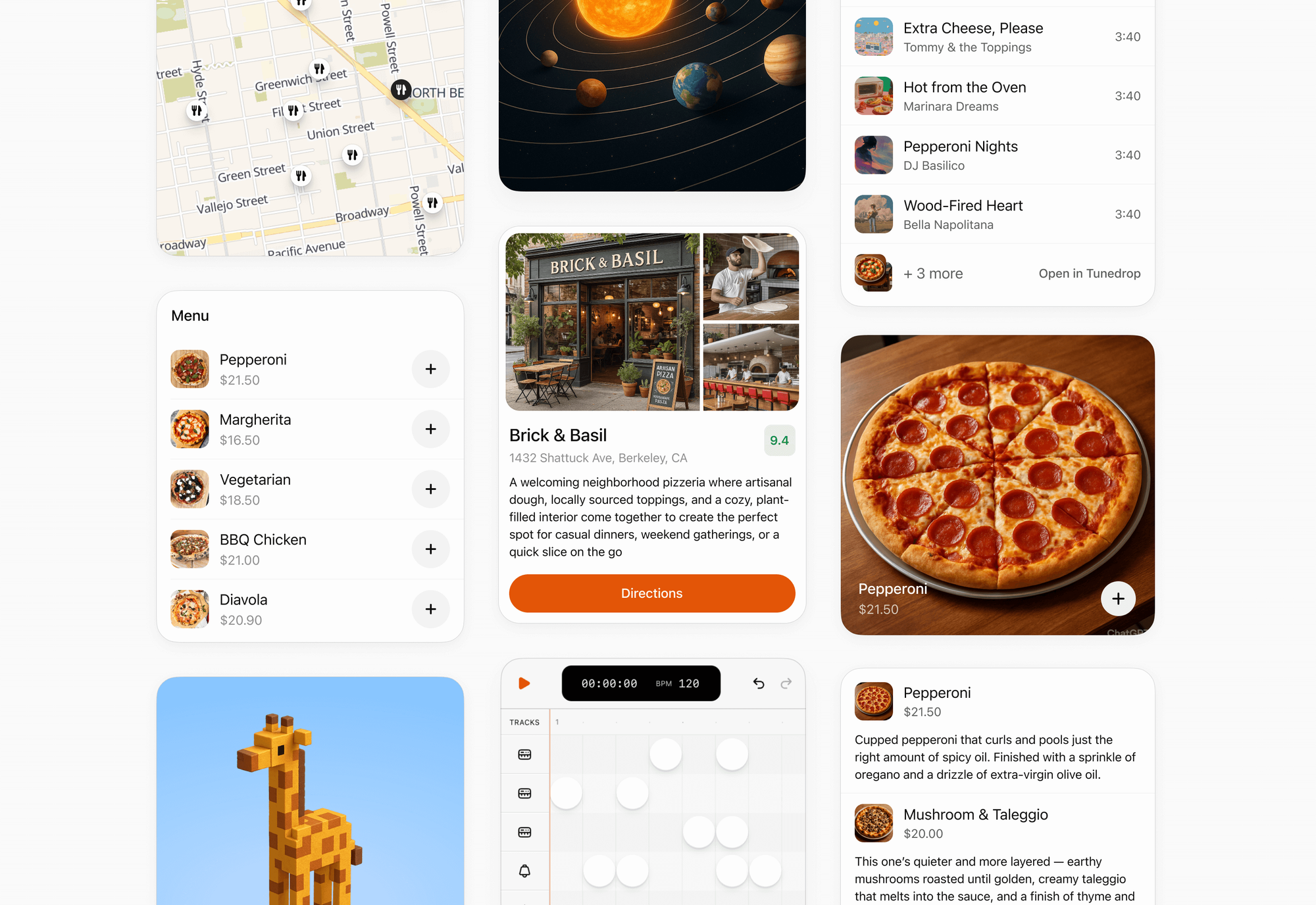
And this goes beyond cards. Maps, menus, media controls, and detail views give people different ways to explore and act.
Give the agent a way to ask for help
This is also another way to think about human in the loop. The interface can help us catch a missing decision before an agent spends hours working around it (and making assumptions on our behalf).
Thariq Shihipar describes a useful example in Seeing like an agent. Claude Code’s AskUserQuestion tool pauses the agent loop and presents structured options for the person to answer. An earlier approach bundled questions with a finished plan, but the answers could change the plan itself. The question was arriving too late.
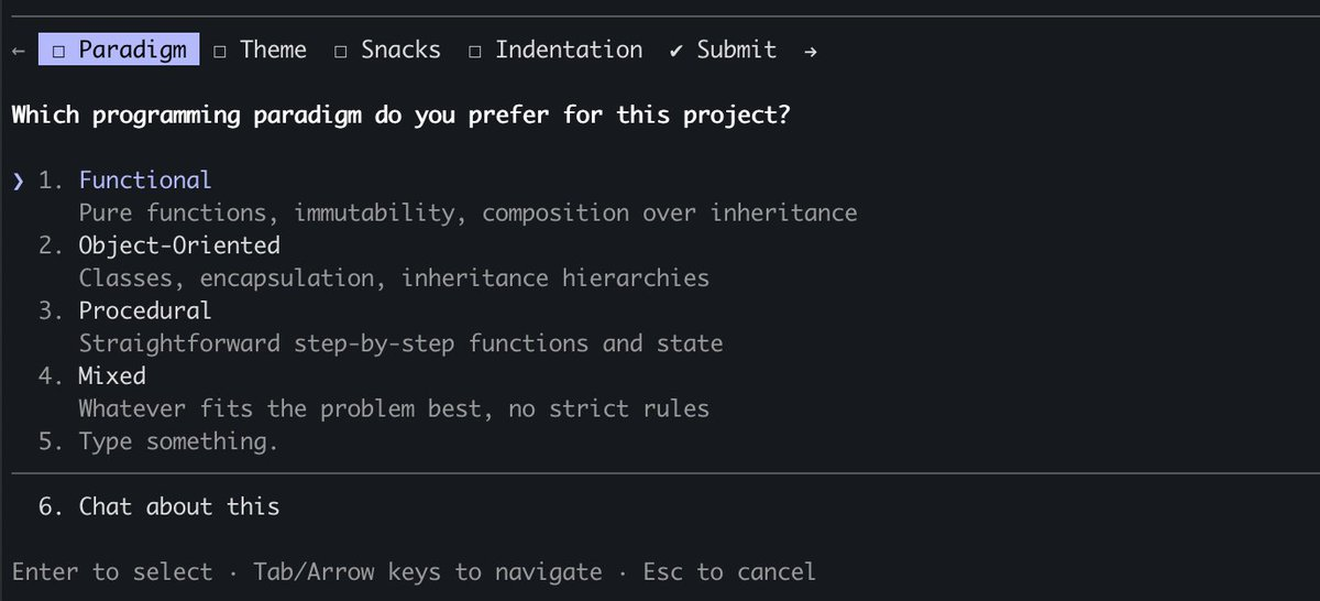
I’m a big fan of terminals, but they ask a lot of someone who just wants help with a task. In a consumer app, that same pause could show a preview of what the agent found and a few clear options for what happens next.
That’s the opportunity I see with UI for MCPs, wherever the host supports it. The agent can bring a decision back to the person in a form they can understand and act on. Behind that screen, the app needs to pause the right action, keep the work done so far, and continue from the answer. The UI and that pause-and-resume behavior have to be designed together.
Ask about everything and we’re back to doing the work ourselves. Ask about nothing and we might discover the wrong assumption much later. I’d give the agent room to act within a clear objective, then bring me in when a missing decision changes the direction or it hits a blocker it can’t resolve.
That might mean less uninterrupted autonomy. It can also mean less wasted work.
I care more about finishing the right task than maximizing how long the agent can go without me.
3. The feedback: look beyond successful calls
Of course, making the experience happen elsewhere raises another question: how do you learn from it?
Our own interfaces have been incredibly useful for that. We can see where people click, where they abandon a flow, and which steps keep causing trouble. When someone starts using the product through an agent, it’s easy to feel like we’ve opened another entrance and forgotten to put any lights along the hallway.
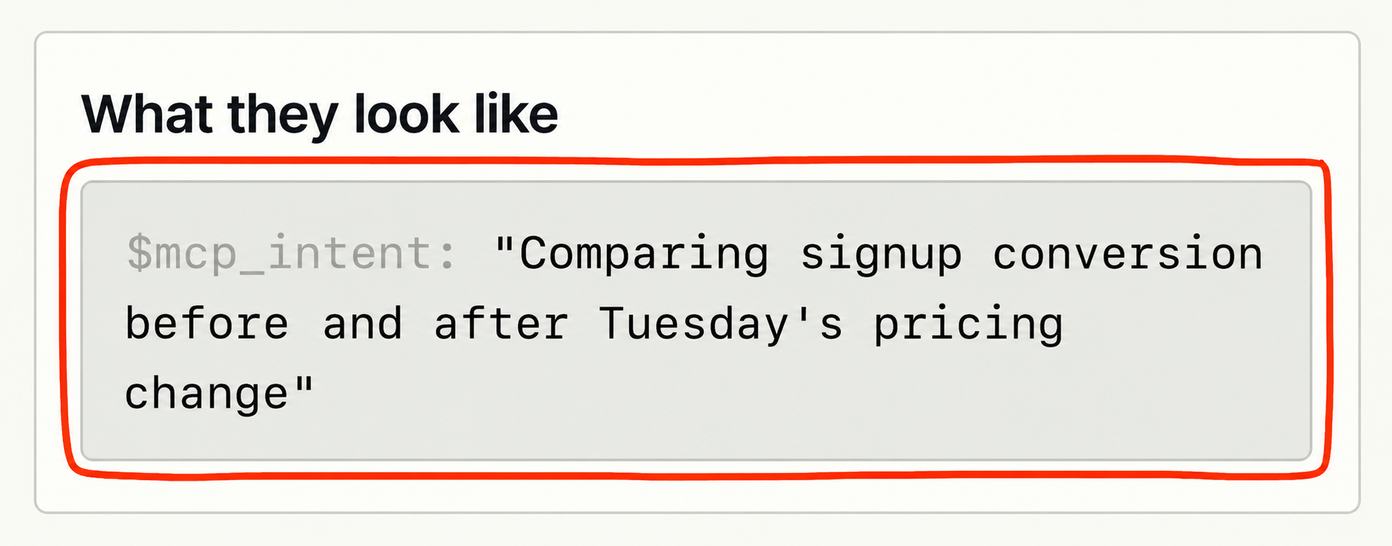
I’ve been using PostHog’s MCP analytics, and this is where things become interesting again. Instrumenting the server gives us a view of tool calls, failures, latency, and related calls within a session.
When captured, the agent’s stated intent also helps explain what it was trying to accomplish. We can start looking at a journey that never touched our website.
What a green status can’t tell us
The part I care about most is what those signals let us question.
If an agent keeps calling the same search tool, is it exploring productively or struggling to find something? If a tool returns successfully, did the result help the person move forward?
A green status tells us the call worked; it doesn’t tell us the task was worth doing, or whether the answer was useful.
There are limits to what we can see, too. Server events don’t automatically reveal the full conversation happening inside another company’s product. We still need feedback and whatever outcome evidence we can legitimately observe.
But even that partial view can help us distinguish a useful workflow from a busy one, which is a much better starting point than counting tool calls and celebrating.
4. Distribution: test the experience in each host
Then comes the part I originally thought would be simple: distribution.
I used to think one MCP link meant one experience everywhere. A single server can serve multiple clients, but the host still determines what people can see, which actions need approval, and how the work continues.
Working on Trackly’s integration for ChatGPT made this concrete (and yes, we’re finally live on a platform with over 1.2 billion weekly users!). Finding fresh jobs, identifying hiring managers, and helping with applications is one product journey. How someone moves through it depends on where they ask for help.
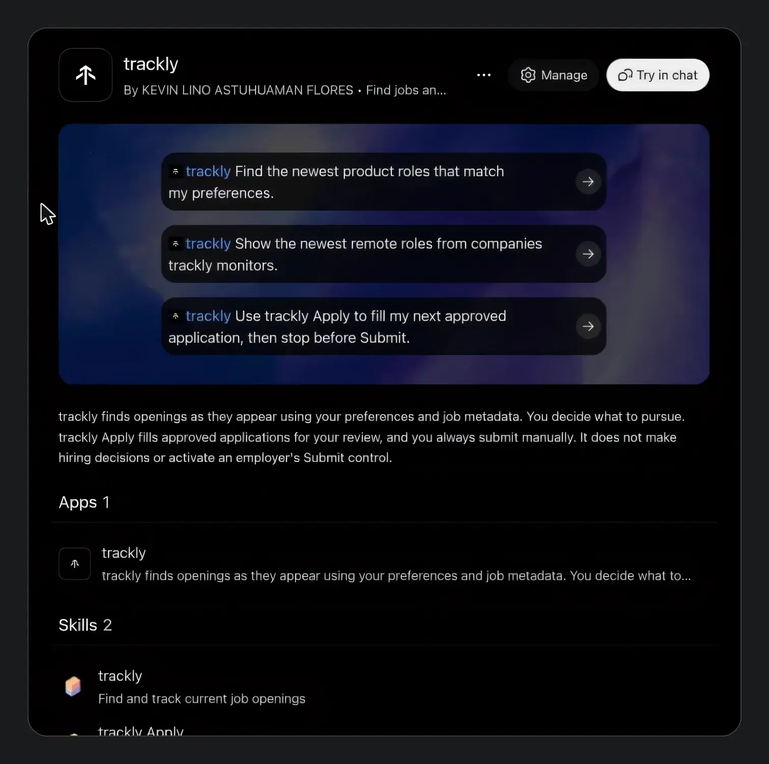
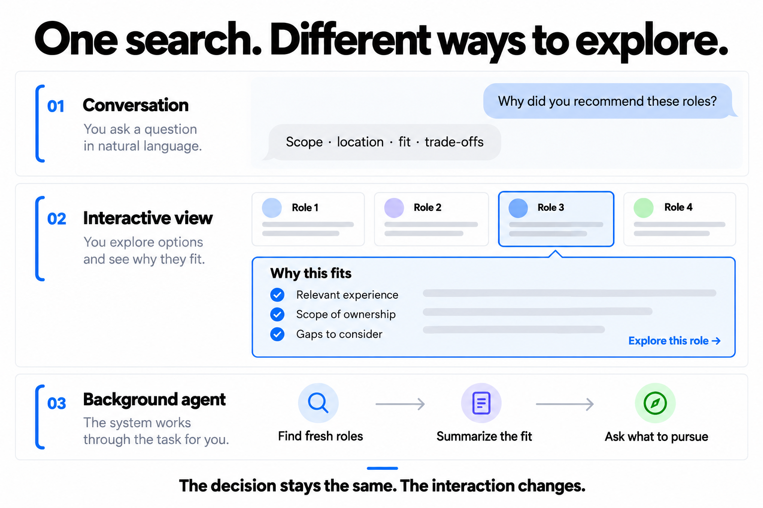
Imagine someone shares their resume and gets several PM recommendations, including a role at Netflix and one at Amazon in Texas. Their next question is: “Why are these a good fit for me?” The answer should explain what they’d own in each role, whether they’d need to relocate, and where their experience matches the requirements or leaves gaps.
I’d want them to scan the recommendations, open three or four that interest them, and understand why each was suggested before choosing what to pursue. In a visual host, that could happen through expandable cards. In a conversation, the agent needs to make the same distinctions clear and remember which opportunities the person is exploring.
Same product, different constraints
The platform docs make this more concrete. Here are four differences I’d design around:
ChatGPT supports MCP Apps UI inside the conversation, with additional host features such as file handling and modals. OpenAI recommends starting with the shared standard and checking whether an extra capability exists before using it. I’d keep the core journey portable, then improve it where the host gives us more room.
Claude supports interactive connectors with inline cards and fullscreen views. People can filter, drill into results, and act from those interfaces. Team administrators can also disable the tools that render UI while leaving text-based functionality available. That makes the experience without the card worth designing too.
Grok Bot works on a persistent cloud computer and can keep going while the person is away. Its changelog also documents interactive cards for supported connector apps. Here I’d pay particular attention to what continues in the background, how progress is preserved, and what brings the person back for a decision.
Muse makes completion part of its connector review. Meta asks for workflows that finish within the approved tool scope, preserve progress through required user input, and get approval each time for sensitive actions. A connection that returns a few links may miss what the platform expects. Approval and discovery are part of distribution too.
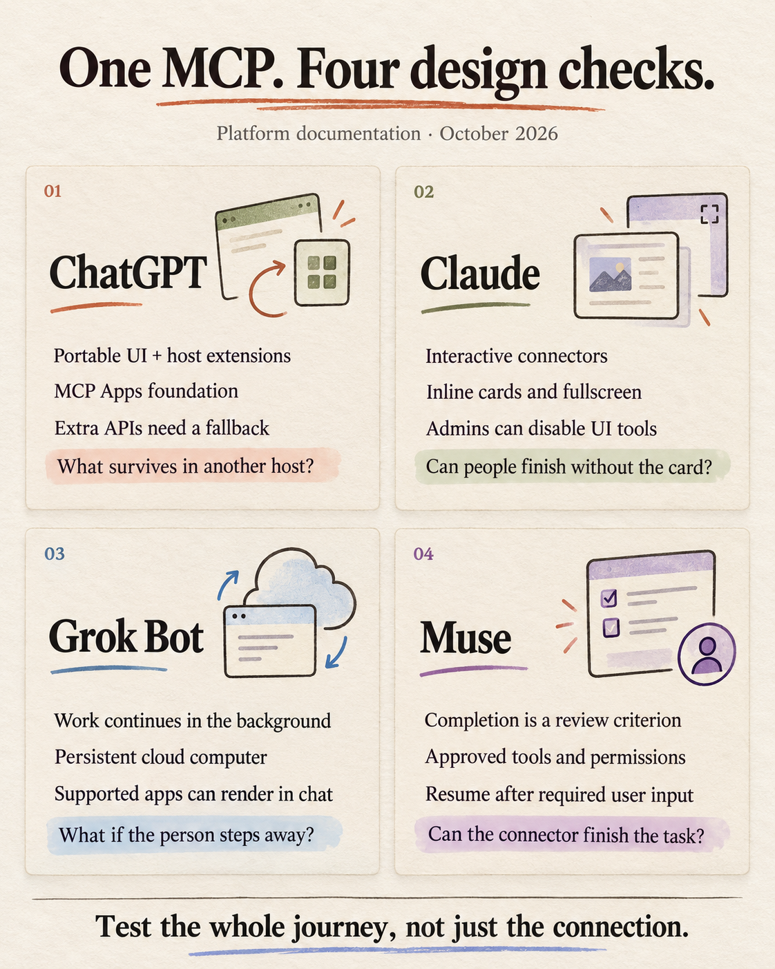
It reminds me of building the same app for iOS and Android. The core product stays the same, but navigation, gestures, and permission flows should feel native to each platform. I’d test the whole journey in each host: finding the right information, making a choice, approving an action, and picking up where we left off.
Getting the MCP connected is the beginning of distribution. The person still has to get somewhere useful.
5. The incentives: let the user finish elsewhere
And underneath all of this is a business question that feels especially exciting if you’re building something new.
We spend so much time trying to bring people into our products. Better onboarding, better navigation, another reason to come back.
Now we can deliberately make the product useful somewhere the person already wants to be.

I know that can mean fewer visits to our own interface, and I’m comfortable embracing that when it helps someone accomplish what they came for.
The incumbent’s dilemma
That can be a harder decision for an incumbent whose business depends on keeping people inside its platform. Years and huge amounts of money spent perfecting an interface can make it difficult to enthusiastically support a route around it.
Thariq put this tension bluntly:
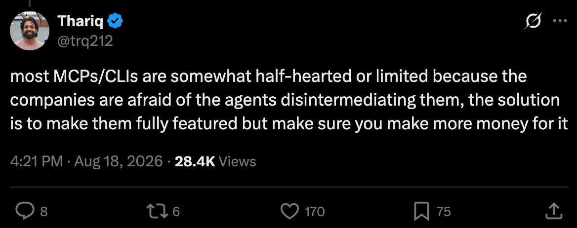
To me, this is how an MCP becomes a lead magnet rather than a product in its own right: enough functionality to get someone interested, but a forced trip back to the main app to finish the job.
A new company has more freedom to ask where the job should happen in the first place. I think that’s an opening worth paying attention to.
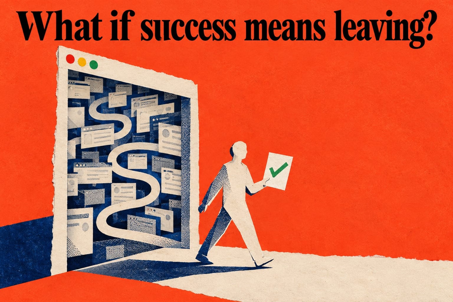
As an app builder, I want to give human UX and agentic UX the same care. Someone should be able to explore directly when they want to, let an agent handle the work when that makes sense, and move between the two without starting over.
The product should feel complete in either experience. Getting someone back to our homepage shouldn’t be a requirement for getting the job done.
6. What are we really calling engagement?
Imagine someone getting the same result in five minutes that used to take an hour inside your app.
Would your team celebrate the time they saved, or worry about the engagement you lost?
Closing note
If you made it this far, I write more about how AI is redefining product development in my newsletter: what I’m trying, what breaks, and how it’s changing the way I think as a PM.
Until next time,
Kevin
Member discussion